Question
Construct the displacement graph for the subway shuttle train as shown in Figure 2.18(a). Your graph should show the position of the train, in kilometers, from t = 0 to 20 s. You will need to use the information on acceleration and velocity given in the examples for this figure.
Final Answer
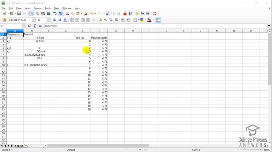
see spreadsheet in the video
Solution video
OpenStax College Physics, Chapter 2, Problem 63 (Problems & Exercises)
vote with a rating of
votes with an average rating of
.
Video Transcript
This is College Physics Answers with Shaun Dychko. We're going to construct a position versus time graph for this shuttle train. To do that, we need to create a data table showing its position at different times from t is zero seconds up to time of 20 seconds. Their position should be in kilometers. Now the information we're given in the examples for the shuttle train are that the initial position is 4.7 kilometers and I've written units in this column here, written amounts here and what the thing is in this column here. The initial velocity is zero. Final velocity is 30 kilometers per hour. We're going to convert this 30 kilometers an hour into meters per second in order to use this value in our calculation for the acceleration because our position is going to be calculated based on the initial position. We're using the y equals y naught plus v naught t plus one half at squared formula here. So we have the initial position, this is y naught, 4.7 kilometers times 1000 meters per kilometer to convert that into meters, plus one half times the acceleration which is in the cell labeled b ten< and there's a dollar sign in front of the ten in order to prevent that ten from changing as they copy the formula down through the rows here, times by a reference to cell e three which is the time squared, and this does not have a dollar sign so that it does change as I copy the formula down and it'll refer to the time in the row which is right beside the number here as I copy it down. All that gets divided by 1000 in order to convert it back into kilometers. So as I go down here you can see how the e eight, e nine, e ten, e eleven that is changing each time. So it's referring to the time right beside it which is good, whereas the b dollar sign ten is not changing because the acceleration is constant throughout this 20 seconds. So, we calculated this acceleration by taking this converted speed in meters per second and then dividing it by the time of 20 seconds. So you can that here where this, when I type into the equation part there, it highlights the cells that are being used in this formula. So that's 8.3 meters per second divided by 20 seconds. Okay. So there we go. We have our data table. Now the next step is to create the graph. By the way, I am using a program called Libre Office which is opensource and free and anyone can download it, just use your search engine to find Libre Office. Let's create a chart, click on the chart button. We're using the x y scatter chart with some lines on it, then click next. Then click this button to select the data range which is already done I guess because I did this before I started the video. But you normally would click that and then click drag over your data range and include the labels for the columns too because that'll -- and with this checkbox there, that will automatically write those words on your chart which is nice. Then click next, and next, and the title is "Position versus Time for the Shuttle Train." The x axis is Time and always put your units on there. Y axis is Position, that's in kilometers, and good to go. There we have it! Our position versus time graph.